One of today’s popular business mantras is "adapt or die." The supposition is that companies need to be responsive to customer needs and adapt to them if they want to survive and succeed (cable companies, apparently, excepted). In this fast-paced world that means you have to make quick decisions and move.
Nothing changes more quickly than the world wide web. Less than a decade ago the majority of people were connecting to your website - if you had one - via dial-up connections. Today, broadband is everywhere. Less than five years ago the average corporate website was nothing more than an online brochure. No one interacted with it. They read it. Not so today.
In 2004 Mark Zuckerberg created “The Facebook”, which was re-named Facebook a short while after its launch. Facebook quickly expanded from Harvard’s campus to other universities and beyond. At the same time Facebook was spreading like a virus blogs were becoming popular. Suddenly, everyone was interacting online. Websites - businesses - had to adapt.
Consumers began purchasing more and more products online and telling their friends about it. They were leaving comments, rating products and their experience. They were grading companies. They had become empowered shoppers. 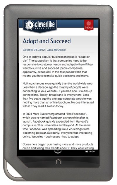 Word-of-mouth testimonials expanded exponentially. Any review, positive or negative, could be viewed by someone in Des Moines or Tokyo simultaneously. This forced corporations to adapt to the new environment that technology had created.
In 2007 Steve Jobs introduced the world to the iPhone and the online world shifted again. People began interacting in new ways. By the time the iPad was introduced in 2010 connectivity was ubiquitous. Today, to stay current and engage a large percentage of your audience, your website needs to respond and adapt to smartphones and tablets, as well as laptops and desktop systems. User experience has to be just as satisfying on the smaller screens of a tablet and smartphone as it is on a desktop computer.
Fortunately, this is now possible with CSS3 (the designers’ language for making your website look pretty, unique, coherent, or whatever your goals are). All smartphones and tablet browsers support CSS3 enough to allow your website to look great on any device.
One Design To Rule Them All
You do not need a separate website for mobile, tablets and the desktop worlds. A website can be made to adapt to the device it is being viewed on. This is known as Responsive and Adaptive design, and it is something we practice at Cleverlike.
Our website, www.cleverlike.com, is responsive. Below is a link to Keene & Sparks, LLP. Their new site is also responsive to the device it is being viewed on. Check out both websites on your PC, iPad, Nook, Nexus, Kindle Fire or smartphone. They shine on any device and the user experience is just as rich.
 I have worked with Jack for 10 years now. He has always been nothing but professional. The artistic designs that he has created for us have been unbelievably magnificent. He is the first guy I recommend to anyone looking for web development. Awesome, awesome work Jack."
 As a new business owner, working with Jack was one of the smartest decisions I have made. He is very easy to talk to, extremely reliable, quick with communication and a wealth of business marketing knowledge. I am a detail-oriented person who had a vision of what I wanted for my website. Jack was so good at honoring all of my requests, answering every rookie question I had and was extremely patient with me as I asked him to fine-tune every detail. The final product was exactly what I wanted. If you are looking for a “coach” in the world of web-design and on-line marketing, Jack is your top choice."
 Jack is brilliant! He has created an amazing website for our studio. We receive daily comments from our students that they love our website and came to see the studio initially because of the website. I would highly recommend!"
 It was clear that he spent time researching my field and similar websites. He was accommodating and listened to what I needed and delivered an exceptional website. Everything was completed in the time we agreed upon and he made adjustments as needed. I absolutely love my new website!"